The wellness industry profits from your anxiety. The cure isn't another miracle supplement. It's the opposite. It's a supplement so boring that it lets you stop worrying and start living.
Health
Boring Health exists to make daily wellness invisible. We create supplements that integrate into your life without demanding attention, ritual, or belief. In a market that rewards noise, we chose silence.
The circular mark alongside the wordmark. Three lockups serve different contexts.
Minimum clear space equals the height of the circular mark. Min logo width: 80px screen, 20mm print.
05Confidence doesn't need volume.
Clinical-grade supplements. No noise. No miracles. Just what works, at the dose that works.
font-family: "Instrument Serif", Georgia, serif;
letter-spacing: -0.03em · line-height: 1.0
"Balance contains 50mg of Apigenin and 500mg of Lion's Mane — both at clinically studied doses."
"Unlock your inner peace with our revolutionary zen formula!"
"A supplement that works. That's it. That's the ad."
"Transform your wellness journey and become the best version of yourself!"
"You probably don't need this. But if you do, it works."
"Don't miss out! Limited time offer! Your health can't wait!"
One product. Clinical doses. Transparent label. The bottle is the brand.
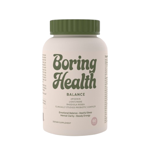
Lion’s Mane Mushroom Extract
Rhodiola Rosea
Clinically Studied Probiotic Complex
Matte white bottle. Minimal label with olive and cream palette. Clinical aesthetic that communicates trust.
10Boring Health is social-first. Awareness, education, and sales flow through content. The feed becomes the storefront.
Aesthetic authority + product awareness. Feed & Stories.
Myth-busting, calling out industry BS. Short-form video.
Long-tail search. Ingredient spotlights, infographics.
Welcome series, abandoned cart, monthly digest. One CTA per email.
“Your supplement doesn’t need a personality. It needs clinical doses of things that actually work.”
“Monday morning. Coffee. Boring Health capsule. That’s the whole routine. No 17-step protocol.”
Every physical interaction reinforces the brand. Restraint, quality materials, and the circular mark as a quiet signature.
350gsm uncoated cotton stock. Matte finish. No gloss, no foil.
No tissue paper, no stickers. Product + thank-you card in kraft box. Less packaging = more trust.
Every paper touchpoint uses the same cotton stock. Texture builds subconscious recognition.
Confirm "Boring Health." Secure .com, social handles, trademark.
Print-ready files based on the label system. Two SKUs.
Mobile-first e-commerce. Two products, one story.
Product photography, first 20 social posts, email templates.
Small audience. Collect feedback. Iterate. Then scale.
| Brand recall | 15% |
| NPS | 50+ |
| Repeat purchase | 40% in 90d |
| Social engagement | 4%+ |
| Email open rate | 35%+ |
| Organic search | Top 20 |
Rule of thumb: If you wouldn't say it to an FDA auditor, don't put it in the ad. All consumer-facing materials must include the FDA structure/function disclaimer.