The wellness industry profits from your anxiety — the fear that you're not doing enough, taking enough, optimizing enough. The cure for that anxiety isn't another miracle supplement. It's the opposite. It's a supplement so straightforward, so evidence-based, so boring that it lets you stop worrying and start living.
Brand
Overview
Boring Health exists to make daily wellness invisible. We create supplements that integrate into your life without demanding attention, ritual, or belief. No superfoods. No miracles. Just well-researched formulations that do what they promise.
In a market that rewards noise, we chose silence. In an industry built on anxiety, we chose boring — because boring is what happens when something just works, and you stop thinking about it. That's the goal.
To make supplements so reliable they become invisible in your routine. Every product must meet three criteria: clinically supported ingredients at effective doses, fully transparent formulations, and a brand experience so calm it reduces decision anxiety instead of creating it.
To become the brand people trust precisely because we never asked them to trust us. We let the product, the ingredients, and the results speak. In five years, Boring Health should be the brand people recommend in a single sentence: "Just take Boring Health."
Every decision starts with "is this necessary?" If an ingredient doesn't have clinical evidence, it doesn't go in the capsule. If a design choice doesn't serve clarity, it doesn't go on the label. Complexity is the enemy.
Full ingredient disclosure with exact dosages. No proprietary blends. No "secret formulas." No hiding behind "clinical strength" when the dose is sub-therapeutic. Our customers are adults who can read a study.
We don't shout. We don't use urgency tactics or fear-based marketing. We don't need influencers to validate us. Our confidence comes from knowing the product works — and that the research backs it up.
Health isn't a moment — it's a daily practice. We build products for the long game, not the quick fix. Boring consistency beats exciting inconsistency every time.
Boring Health operates as a standalone consumer brand within the Bio Tech portfolio. The parent company is invisible to the consumer.
The Bio Tech name does not appear on any consumer-facing material. Boring Health is the brand the customer knows, trusts, and recommends.
08Target
Audience
Adults aged 28–45 who have moved past the "wellness discovery" phase. They've tried the trending supplements, the adaptogens, the nootropics. They're tired of marketing theatrics and want something backed by evidence. They value competence over charisma, dosing over branding.
| Age | 28 – 45 |
| Income | $55K – $130K |
| Education | College-educated |
| Location | Urban / suburban US |
| Gender | 55% female, 45% male |
| Values | Evidence, simplicity, autonomy |
| Reads | Wirecutter, Examine.com |
| Avoids | Hype, influencer culture, MLM |
| Buys from | Ritual, Athletic Greens, Thorne |
| Needs | Stress relief, sustained focus |
"I'm so tired of every brand telling me I need to optimize. I just want something that works without making me feel like I'm behind."
From user research, Jan 2026. This is the anxiety the industry creates — the feeling that you're not doing enough. "Boring" is our answer: you're doing fine. Take this. It works. Move on with your day.
The wellness industry creates anxiety to sell you the cure. You're not sleeping enough, focusing enough, recovering enough. Every brand promises transformation. The noise itself becomes the illness.
The antidote to overstimulation isn't more stimulation. It's less. When something truly works, it becomes invisible. You stop thinking about it. It becomes... boring.
Boring Health is a provocation disguised as a promise. It says: we won't excite you, we won't sell you a lifestyle, we won't create anxiety to justify our existence. We'll just give you something that works. And that's the most radical thing a supplement brand can do.
The cure for
wellness anxiety
is boring.
Market
Positioning
The supplement market is crowded at the extremes. Boring Health occupies the deliberate gap in between: clinical credibility meets design simplicity, without the lifestyle performance.
Boring Health positions at the intersection of clinical credibility and lifestyle accessibility — premium enough to signal quality, boring enough to signal confidence.
14Understanding the landscape helps enforce our positioning. Boring Health doesn't compete on price or hype — we compete on trust, transparency, and restraint.
| Brand | Price Point | Positioning | Channel | Boring Health's Edge |
|---|---|---|---|---|
| Thorne | $35–$65/mo | Clinical, practitioner-grade | Pro referral, DTC | More approachable design & voice |
| Ritual | $35–$45/mo | Lifestyle premium, transparency | DTC, Instagram-heavy | Clinical dosing, less trend-chasing |
| Thesis | $79/mo | Personalized nootropics | Quiz funnel, DTC | Simplicity — focused SKU, not 20 |
| OLLY | $15–$25/mo | Fun, mass-market wellness | Retail (Target, CVS) | Clinical credibility, premium feel |
| Nature Made | $10–$20/mo | Commodity, pharmacy aisle | Mass retail | Brand identity, design, voice |
Price points are approximate monthly cost for comparable product. Boring Health targets $38/month — the sweet spot between Ritual's lifestyle premium and Thorne's clinical authority.
15For health-conscious adults who are tired of supplement industry noise, Boring Health delivers clinical-grade formulations in a format that respects your time, intelligence, and wallet.
No proprietary blends. Every ingredient and dosage is disclosed. When a competitor hides behind "proprietary," they're hiding underdosing.
One product, done right. Balance — a single formulation addressing emotional balance, restful sleep, mental clarity, and steady energy. We don't sell a wall of 40 SKUs. We solve the problems that matter.
The anti-hype brand. In a market of screaming labels and influencer deals, our quietness is our signal. Confidence doesn't need volume.
Brand Personality
& Voice
If Boring Health were a person, they'd be the friend who's a doctor but never brings it up at dinner. Competent without being showy. Helpful without being pushy. The kind of person who sends you one article link instead of a lecture.
We never use urgency, scarcity, or fear. Our tone is steady. Our confidence comes from the product, not the pitch.
We say what the product does. No metaphors, no poetry, no wellness jargon. If it reduces cortisol, we say it reduces cortisol.
Clinical doesn't mean cold. We're approachable, conversational, and human. We care about the person, not just the customer.
Dry, understated, smart — never trying too hard to be funny. We have a sense of humor about ourselves.
Every brand unconsciously embodies an archetype. Knowing ours gives every designer, writer, and strategist a shared mental model for decision-making.
The Sage seeks truth through knowledge and analysis. They believe the path to a better world is through understanding, not persuasion. Their power is expertise, their gift is wisdom, and their fear is being misled or misleading others.
Evidence-first communication. Full dose transparency. Citing studies, not testimonials. Letting the data speak. Trusting the customer's intelligence.
The Caregiver nurtures through competence, not emotion. They don't smother — they equip. Their strength is consistency, their gift is dependability, and their fear is helplessness or selfishness.
Warm but not saccharine tone. Customer service that educates. Packaging that informs. A subscription model that's easy to cancel. Care through respect.
The Magician — we don't promise transformation. The Hero — we don't position the customer as broken. The Jester — we don't use humor to deflect from substance.
Before any piece of content goes live, ask: "Would a wise, caring doctor say this?" If yes, ship it. If it sounds like a marketer, a guru, or a comedian — rewrite it.
"Balance contains 50mg of Apigenin and 500mg of Lion's Mane — both at clinically studied doses."
"Unlock your inner peace with our revolutionary zen formula!"
"A supplement that works. That's it. That's the ad."
"Transform your wellness journey and become the best version of yourself!"
"You probably don't need this. But if you do, it works."
"Don't miss out! Limited time offer! Your health can't wait!"
Our voice is constant. Our tone shifts depending on context.
"We tested this for two years. Here's what the studies show."
"Your brain deserves better than a gas-station energy shot."
"500mg of Lion's Mane — the dose that actually shows up in studies."
"It works. You'll notice. We don't need to convince you."
The dot represents our default. Each example shows how that position manifests in actual copy. Context may shift the tone slightly, but we never reach either extreme.
21Visual
Identity
The Boring Health mark is a circular badge containing the brand name in a retro groovy serif. The roundness communicates approachability. The muted olive palette signals maturity and trust.
Minimum clear space equals the radius of the mark on all sides. No elements should encroach on this boundary.
Print: 20mm diameter. Digital: 32px diameter. Below this threshold, use the wordmark alone.
The circular mark adapts to different contexts. On dark backgrounds, use the light-reversed version. Always ensure sufficient contrast.
- Stretch or distort the circular mark
- Add drop shadows or outer glows
- Change the logo colors
- Place on busy photographic backgrounds
- Rotate the mark
- Maintain circular proportions
- Use approved color variants only
- Respect minimum clear space
- Scale proportionally from center
- Use on solid or simple backgrounds
Color
System
Color is used with restraint. The dominant experience of the brand is white space and typography. Color enters as an accent, a signal, or a moment of warmth — never as decoration.
| Context | Primary | Secondary | Accent | CTA |
|---|---|---|---|---|
| Website | 15% | 10% | 5% | 3% |
| Packaging | 30% | 20% | 8% | 2% |
| Social media | 20% | 15% | 8% | 5% |
| 10% | 5% | 3% | 5% |
The remaining percentage is always white or ivory. White space is the dominant brand element.
28Every color combination used in Boring Health materials must meet WCAG 2.1 AA standards (4.5:1 for body text, 3:1 for large text). The palette was designed with these constraints as inputs, not afterthoughts.
| Combination | Ratio | AA Body | AA Large | Usage |
|---|---|---|---|---|
| Olive on White | 5.74:1 | ✓ Pass | ✓ Pass | Primary text, headings |
| Olive on Warm Cream | 4.52:1 | ✓ Pass | ✓ Pass | Packaging, labels |
| Ink on White | 14.5:1 | ✓ AAA | ✓ AAA | Body text (primary) |
| Ink on Warm Cream | 11.4:1 | ✓ AAA | ✓ AAA | Body text on backgrounds |
| Ocean on White | 5.88:1 | ✓ Pass | ✓ Pass | CTAs, links, highlights |
| Ocean on Warm Cream | 4.63:1 | ✓ Pass | ✓ Pass | Links on cream backgrounds |
| White on Olive | 5.74:1 | ✓ Pass | ✓ Pass | Buttons, reversed text |
| White on Ocean | 5.88:1 | ✓ Pass | ✓ Pass | CTA buttons, badges |
| Warm Sand on White | 2.46:1 | ✗ Fail | ✗ Fail | Decorative only, never text |
| Mist on White | 1.36:1 | ✗ Fail | ✗ Fail | Background fills only |
Ocean (#2B6B8A) is the only color in the palette that creates true visual tension. Use it for: CTA buttons, link text, notification badges, data highlights, and pull-quote accents. Never for body text or large backgrounds. It exists to make things happen.
Warm Sand (#C4A882) and Mist (#D0DEE4) fail body-text contrast. Use them exclusively for: borders, background fills, dividers, tag backgrounds, and secondary icons. When in doubt, pair with Ink text, never Olive.
Confidence
doesn't need
volume.
Typography
The spacing contrast between serif and sans-serif is intentional. Serifs run tight to feel editorial and grounded. Sans-serif labels run tracked to create hierarchy and signal "utility." This contrast is the typographic engine of the brand.
| Role | Typeface | Tracking | Rationale |
|---|---|---|---|
| Display (72px+) | Instrument Serif | -0.03em | Tight. Headlines feel weighted, grounded, authoritative. |
| H1 (48px) | Instrument Serif | -0.025em | Slightly less tight. Readability increases at smaller display sizes. |
| Pull Quotes | Instrument Serif | -0.01em | Natural. Quotes need to breathe — conversational, not compressed. |
| H2 / Labels | Inter | +0.10 to +0.12em | Wide tracked. ALL-CAPS labels signal "system" and "utility." |
| Body (14px) | Inter | +0.005em | Nearly default. Optimized for long-form reading comfort. |
| Caption (11px) | Inter | +0.04em | Slightly open. Improves legibility at small sizes. |
| Mono (code) | JetBrains Mono | +0.02em | Standard. Technical data, hex values, specs. |
Serifs compress. Sans-serifs expand. This contrast creates the push-pull tension that makes Boring Health's typography feel intentional, not accidental.
Track a serif display headline at +0.1em. It looks fractured. And never compress an uppercase sans-serif label — it becomes unreadable.
ment
Serif
contemporary.
screen-optimized companion.
Photography
& Imagery
Photography for Boring Health should feel found, not staged. Natural light. Muted warmth. Textures and materials over faces and poses. The imagery communicates quality through restraint, not glamour.
Natural light, desaturated warmth, real textures, quiet moments, negative space
Flash photography, neon colors, stock photo smiles, busy backgrounds, heavy filters
Minimal, two-sided design. Dark front with logo and tagline. Light back with contact details and watermark mark.
+1 (555) 234-5678
boringhealth.com
Standard US business card: 3.5 × 2 inches (89 × 51mm). Printed on 350gsm uncoated cotton stock.
Matte uncoated. No gloss, no UV spot, no foil. The paper texture is the tactile element.
Every physical interaction reinforces the brand. Restraint, quality materials, and the capsule mark as a quiet signature.
Kraft-toned stock. Rope handles in amber. Capsule mark ghosted, not printed solid.
Included in every shipment. A5 format, same uncoated cotton stock as the business card.
No tissue paper, no stickers, no branded tape. The product sits in a kraft box with the thank-you card. Less packaging = more trust.
Every paper touchpoint uses the same 350gsm uncoated cotton stock. Texture consistency builds subconscious brand recognition.
Applications
One product. Clinical doses. Transparent label. The bottle is the brand.
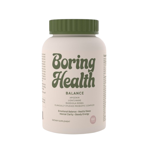
Lion’s Mane Mushroom Extract
Rhodiola Rosea
Clinically Studied Probiotic Complex
Matte white bottle. Minimal label with olive and cream palette. Clean, clinical aesthetic that communicates trust.
40Instagram-first content strategy. Four pillars, two visual formats.
deserves
better.
Four platforms. Four distinct roles. Content is adapted per channel, never duplicated.
Aesthetic authority + product awareness. Typography-led visuals, flat-lay photography, muted tones.
Myth-busting, calling out industry BS. Conversational tone, fast cuts, text overlays. Virality through honesty.
Long-tail search play. Ingredient spotlights, infographics, “boring wellness” aesthetic boards.
Welcome series, abandoned cart recovery, monthly digest. Short, honest, one CTA per email.
The Instagram feed is a storefront. Every post follows a visual rhythm: quote, product, education, lifestyle, testimonial — on a rotating color palette of olive, cream, ocean, and ivory.
- Flat lay, minimal props, natural light
- Generous negative space in every frame
- Instrument Serif for headlines in posts
- Inter for body text and captions
- Muted earth tones, desaturated warmth
- One focal point per image
- Neon colors or saturated gradients
- Busy backgrounds or visual clutter
- Exclamation marks in captions
- Before/after transformation photos
- Stock photos of people laughing at salads
- Emoji-heavy captions or clickbait text
Every caption follows the brand voice: direct, self-aware, never preachy. Short paragraphs. No exclamation marks.
“Your supplement doesn’t need a personality. It needs clinical doses of things that actually work.”
“Monday morning. Coffee. Boring Health capsule. That’s the whole routine. No 17-step protocol.”
“Ashwagandha: 600mg. Peer-reviewed. Not influencer-reviewed.”
#NoHypeJustResults
#ClinicalDoses
#SupplementScience
#QuietWellness
#JustTakeThePill
Caption rule: If it sounds like it belongs on a detox tea ad, rewrite it.
This brand book is a starting point, not an endpoint. The following actions bring the Boring Health brand to market.
Confirm "Boring Health" or explore alternatives. Secure .com, social handles, trademark search.
Commission final packaging design. Prepare print-ready files based on the label system defined here.
Minimal, conversion-focused e-commerce. Two products, one story. Apply brand guidelines to every element.
Commission product photography. Write first 20 social posts. Build email templates.
Launch with a small audience. Collect feedback. Iterate. Then scale.
Boring Health operates in the dietary supplement category, which is regulated by the FDA and FTC. All brand communications must comply with these frameworks. This is not optional — it is the foundation of brand trust.
We may describe how a product supports body structure or function ("supports focus," "promotes calm"). We may never claim to diagnose, treat, cure, or prevent any disease. Every product page and label must carry the FDA disclaimer.
We don't say "better than prescription medication" or "replaces your SSRI." We don't reference clinical studies we haven't funded or verified. Every efficacy statement must be substantiated and reviewed by legal counsel.
Customer testimonials must reflect typical results and include appropriate disclaimers. We never fabricate reviews. Influencer partnerships must disclose compensation per FTC guidelines (#ad, #sponsored).
All consumer-facing materials must include: "These statements have not been evaluated by the Food and Drug Administration. This product is not intended to diagnose, treat, cure, or prevent any disease."
Rule of thumb: If you wouldn't say it to an FDA auditor, don't put it in the ad.
A brand without measurement is decoration. These are the signals that tell us Boring Health is working.
| Metric | Target (Year 1) | Measurement |
|---|---|---|
| Brand recall | 15% unaided in target demo | Quarterly survey |
| NPS | 50+ | Post-purchase survey |
| Repeat purchase rate | 40% within 90 days | Shopify analytics |
| Social engagement rate | 4%+ on Instagram | Monthly reporting |
| Organic search share | Top 20 for "clean supplements" | SEMrush / Ahrefs |
| Email open rate | 35%+ | Klaviyo dashboard |
Social mentions, "Boring Health" brand searches, direct traffic growth, customer reviews mentioning brand values (quiet, honest, simple).
Monthly: social + email metrics. Quarterly: brand recall + NPS survey. Annually: full brand audit against this guidelines document.